Tuesday 25 March 2014

HTML5 Game Engine and Framework

HTML5 Game Engine and Framwork :

http://techslides.com/html5-game-engines-and-frameworks/

http://www.html5gamedevelopment.com/html5-engines 

If you are creating HTML5 games, it makes a lot of sense to start out with some game engine or framework. The good news is that there are many free HTML5 game engines and frameworks out there, from very minimal to pretty complex. Below I will cover some of the most popular HTML5 game frameworks and I will also cover particle systems, game tutorials, examples, and demos. To start, I think it makes a lot of sense to take a step back and watch these slides on HTML5 game development.

So, let’s get right into the list of the best engines and frameworks for HTML5 games:
EnchantJS – is a HTML5/JavaScript Based Game Engine with many features like Object Direction, Asynchronous Processing, Plugin Expansion, and Visual Material. Guts Rodsavas has a great article on making a simple HTML5 game with Enchant.js.
Impact – a JavaScript Game Engine that allows you to develop stunning HTML5 Games for desktop and mobile browsers. Check out this car racing game built with Impact.
Crafty – JavaScript HTML5 Game Engine that is small in size but has great features like collision detection, sprite map support, and much more. Here is a good intro to Crafty
Pulse – 2d JavaScript Game and Graphics Engine with some cool demos.
Phaser – a light-weight 2D game framework for making HTML5 games for desktop and mobile browsers.
MelonJS – a lightweight HTML5 game engine with a great feature list.
LimeJS – HTML5 game framework for modern touchscreens and
desktop browsers. Pablo Farias Navarro has a great tutorial on building a game with limejs.
Isogenic Game Engine – a very advanced 2d and isometric HTML5 game engine. Check out their demos for the Angry Birds clone.
Cocos2d Game Engine – a 2D game/graphics engine based on cocos2d for iPhone but designed to run in the web browser.
PlayN – a cross-platform game abstraction library for writing games that compile to many different platforms (HTML5, iOS, Flash, etc). Chrome version of Angry Birds was written using PlayN.
Canvas Game Engine – minimal game engine with some cool examples.
Quintus – an easy and fun JavaScript HTML5 game engine for mobile, desktop and more.
Coquette – a micro framework for JavaScript games.
Greensock – awesome JavaScript animation framework.
Physics – a two-dimensional port into JavaScript of the popular Traer Physics Library from Processing.
Cube Engine – 3D engine completely written in HTML5 without OpenGL.
Phoria 3D – a JavaScript library for simple 3D graphics on a canvas 2D renderer (without WebGL).
Box2DJS – a JavaScript port of Box2D Physics Engine built on Prototype. There is a great tutorial on writing a game with Box2D from tutsplus. Personally, I prefer the jQuery version of Box2D. We also have the Box2DFlash port to javascript and boxbox, a fun and simple framework for making games with the box2d physics engine.

3D and WEBGL Game Engines

Babylon JS – JavaScript framework for building 3D games with HTML 5 and WebGL.
Goo Engine – uses the WebGL standard to utilize the graphics hardware to the max.
Gladius – a 3D game engine which includes an entity/component framework, WebGL graphics rendered with CubicVR.js, and 2D physics based on box2d.js.
Three.JS – a popular JavaScript 3D library with great documentation and awesome demos.
CubicVR 3D Engine – open-source 3D Engine with many cool examples. Just checkout this cubicvr demo.
GLGE – a javascript library intended to ease the use of WebGL
copperlicht – a fast WebGL JavaScript 3D Engine.
Gamma – a new Javascript library which can be used to create 2.5D platform games for a web browser using the power of HTML, JavaScript, CSS and WebGL.
PhiloGL – from SenchaLabs is a WebGL Framework for Data Visualization, Creative Coding and Game Development.
SceneJS – an open-source 3D engine for JavaScript which provides a JSON-based scene graph API on WebGL
curve3d – an open-source cross-browser 3D engine written in pure JavaScript.
C3DL – a Canvas 3D JavaScript library that will make it easier to write 3D applications using WebGL.
x3dom – a framework for integrating and manipulating X3D scenes as HTML5/DOM elements
Pre3d – a JavaScript 3d rendering engine
JS3D – a library which allows you to have interactive 3d objects on your website, such as the spinning cube at the top of the page.
I also really like the OSG.JS WebGL framework but I would not really call it a game framework. SpiderGL is pretty cool and I really liked these webgl samples.
Play Canvas – a professional 3D game engine and hosted platform. Just checkout their demo of Doom 3 Monsters dancing Gangnam Style.
voxeljs – an open source voxel game building toolkit for modern web browsers.
Pixi.js – 2D webGL and canvas renderer.

Game Tutorials and Examples

Build New Games has some great information on developing HTML5 games and if you are thinking about mobile, I definitely recommend reading their mobile game primer, DOM Sprites, and Particle Systems From the Ground Up. Andres Pagella also has a great article on particle systems in HTML5 Canvas. I also recommend reading about CSS Tricks for HTML5 Canvas Games, using texture atlasing, requestAnimationFrame, and optimizing your game loop.
If you are looking for complete tutorials on building games from scratch, I really liked this simple racing game tutorial and building a sea battle game with HTML5 APIs. I also highly recommend checking out these game development tutorial links from Game From Scratch. Finally, here is a great list ofHTML5 game tutorials from Bashookah. And, here is a list of more great HTML5 game tutorials:
Developing mobile games without UIWebView
Building a first person shooter game with webgl and three.js
Making a Speedy HTML5 Game
Building a tank shooting game with threejs, backbone, and GLSL
Detailed tutorial on building a Ping Pong Game with HTML5 Canvas and Sounds
Old Snake game on CSSDeck
Easy-to-implement, customizable virtual game controller for HTML5 games
HTML5 snake game with source code walkthrough
Tiny Platformer game on HTML5 Canvas with source code

Final Thoughts

If you are building any of these games using NodeJS, I recommend checking out Pomelo, a fast, scalable game server framework for node.js. If you are looking for a platform to build and deploy your HTML5 Game, I recommend checking out StackMob, Fat Fractal, Parse, Kinvey or Turbulenz. Also, Turbulenz HTML5 game engine is now open sourced.
Finally, if you can’t find what you need in the list above, check out this website dedicated to various HTML5 game engines. You can also check out this impressive GitHub wiki page of HTML5 game engines.

Update:

I have mentioned box2dweb above but did not also include other physics engines like Cannon.js, JigLibJS, and Ammo.js so if you are interested in comparing physics engines I highly recommend this article from buildnewgames. The article does not mention Chipmunk-js and Verlet which are great physics engines written in JavaScript.
I have also recently stumbled on sparks.js which is a simple and fast JavaScript library for creating 3D particles. Also, Coquette is a micro framework for JavaScript games and EndGate is a game framework that is used to build powerful HTML5 games.
In terms of game tutorials, this is a great tutorial on how to build a simple HTML5 game with box2d. Here is another good one on loading large assets in modern html5 games. And this is a good html5 mobile gaming performance comparison.
I would keep my eyes on SterlingJS development, it looks promising. Also, Breakouts is a website that shows various implementations of the classic game Breakout in numerous different engines. It helps you decide which engine is best for your game.
Finally, I have recently stumbled on cgSceneGraph which is a powerful, cross-platform and very easy-to-use HTML5 canvas JavaScript framework.

External:

clay.io – HTML5 Game API for developers and centralized location to play HTML5 games for gamers
Game console browsers – showing level of support for HTML5, CSS3, and Acid3 across many TV and portable console browsers
Building a Game With JavaScript
Time Based Animations in HTML5
JS Animation Frameworks
15 JavaScript Animation Frameworks
Simple painting game with HTML5 canvas
Optimizing JavaScript Games
HTML5 Gaming: Benchmarking Sprite Animations
HTML5 Gaming on the Mobile Web
Getting Started With HTML5 Game Development
15 best HTML5 game engines

HTML5 Game Development Guide

http://www.html5gamedevelopment.com/html5-engines

HTML5 Engines and JS framework:

Quintus Engine

The Quintus engine is a simple HTML5 game engine designed to be modular and lightweight, with a concise JavaScript-friendly syntax.
Read More...


Colbalt Calibur 3: Open-source Canvas+Node MMO

Colbalt Calibur 3 is an real-time-ish multi-player MMO that uses Canvas and Node.js. It's open source duel licensed under the BSD/GPL.
Read More...


DivSugar, a CSS-based 3D Graphics Engine

DivSugar is a CSS3 based 3D graphics engine. While it's not as performant as a WebGL might be for full games, the fact that it uses CSS3 means that it can easily be integrated into existing sites and be used for casual games.
Read More...


IvanK Lib: a WebGL based HTML5 engine

IvanK Lib is a HTML5 Engine inspired by Flash (the tag line is actually "Like Flash, but faster" that uses the power of GPU accelerated WebGL to render 2d graphics on the screen.
Read More...


J3D - Javscript / WebGL Engine

J3D is a relative newcomer on the WebGL 3D Javascript scene. J3D most interesting feature is that it provides a tool pathway from the popular Unity 3D into the engine. Check out the step-by-step tutorial for more details.
Read More...


GameMaker HTML5

Categories: Canvas, Commercial
GameMaker HTML5 is an HTML5 port of the commercial GameMaker game building system currently in open beta.
Read More...


RPG.js

Categories: Canvas, Open-source
RPG.js is a HTML5 Game Framework focused on building 2.5D Zelda Bitmap-based Role Playing Games.
Read More...


PhiloGl

Categories: Open-source, Top Pick, WebGL
WebGL framework for Data Visualization, Creative coding and Game Development
Read More...


Crafty.js

Categories: Canvas, Open-source, Top Pick
An open source beta JS Engine.
Read More...


Impact.js

Categories: Canvas, Commercial, Top Pick
A modern, well-supported commercial HTML5 games engine.
Read More...
Phonegap Push Notification Support

Ref Link :
http://devgirl.org/2013/01/24/push-notifications-plugin-support-added-to-phonegap-build/

Full Project in Git hub link
https://github.com/hollyschinsky/PhoneGapBuildPushProject2/

pgb I’m happy to post today there is now support for a generic push notifications plugin for PhoneGap Build. The new plugin is called PushPlugin and works for both iOS and Android push notifications. The iOS support is based on the Apple Push Notifications Service (APNS) and the Android support is based on Google Cloud Messaging (GCM). This has been a highly awaited need and I’m so glad I can finally share the good news. apple-push-notification-service
The details are all outlined well here with some sample code but I also created a quick sample project you can use for a reference that will work for both iOS and Android. I put the whole project including the XCode project in github, but you really only need the www folder for PhoneGap Build. There’s also a config.xml included you can use that includes the plugin reference there and is required for the native code to be added when built through PhoneGap Build. You will just need to change the application name, author and personal information in there to match your own :) You will also need to change the GCM id to match your sender id in the index.js file. Also, see my previous tutorials on push notifications for iOS and Android to get some sample code in PHP or node.js to send a push notification quickly for testing so you can see it all in action. Those posts used the previous plugins available however, you should use the most currently supported PushPlugin one now. Those posts also talk in-depth about signing up for GCM and how to use APNS as well.
I will also be holding two webinars on push notifications in February via Adobe TechLive, so come check those out for a walkthrough of how to get started with adding push notifications to your application for iOS and Android. I will talk more about the APIs and how to use them at that time as well. The PhoneGap Build team is busy working on additional support for more plugins. The currently supported ones can be found here: http://build.phonegap.com/docs/plugins.
The important parts of the code are outlined in the PushPlugin documentation but I’m also showing them from my sample here. It’s easier to see quickly how this new plugin could be used to register your device to receive notifications, and how you might handle the incoming message simply in the following:
1
2
3
4
5
6
7
8
9
10
11
12
13
14
15
16
17
18
19
20
21
22
23
24
25
26
27
28
29
30
31
32
33
34
35
36
37
38
39
40
41
42
43
44
45
46
47
48
49
50
51
52
53
54
55
56
57
58
    receivedEvent: function(id) {
        var pushNotification = window.plugins.pushNotification;
        if (device.platform == 'android' || device.platform == 'Android') {
            pushNotification.register(successHandler, errorHandler,{"senderID":"834841663931","ecb":"onNotificationGCM"});
        }
        else {
            pushNotification.register(this.tokenHandler,this.errorHandler,   {"badge":"true","sound":"true","alert":"true","ecb":"app.onNotificationAPN"});
        }
...
    }
 
   // iOS
    onNotificationAPN: function(event) {
        var pushNotification = window.plugins.pushNotification;
        console.log("Received a notification! " + event.alert);
        console.log("event sound " + event.sound);
        console.log("event badge " + event.badge);
        console.log("event " + event);
        if (event.alert) {
            navigator.notification.alert(event.alert);
        }
        if (event.badge) {
            console.log("Set badge on  " + pushNotification);
            pushNotification.setApplicationIconBadgeNumber(this.successHandler, event.badge);
        }
        if (event.sound) {
            var snd = new Media(event.sound);
            snd.play();
        }
    },
    // Android
    onNotificationGCM: function(e) {
        switch( e.event )
        {
            case 'registered':
                if ( e.regid.length > 0 )
                {
                    // Your GCM push server needs to know the regID before it can push to this device
                    // here is where you might want to send it the regID for later use.
                    alert('registration id = '+e.regid);
                }
            break;
 
            case 'message':
              // this is the actual push notification. its format depends on the data model
              // of the intermediary push server which must also be reflected in GCMIntentService.java
              alert('message = '+e.message+' msgcnt = '+e.msgcnt);
            break;
 
            case 'error':
              alert('GCM error = '+e.msg);
            break;
 
            default:
              alert('An unknown GCM event has occurred');
              break;
        }
    }

Tuesday 18 March 2014

HTML5 game Dev Ref link 18 marc-2014

18-mar-2014 :
==============
http://coding.smashingmagazine.com/2011/05/17/an-introduction-to-css3-keyframe-animations/

http://brundamerinal.blogspot.in/


code: <link rel="shortcut icon" href="gng.jpg" /> icon on html tab in browser --copy and paste the code working...

simple keyframe example link - have to assemble code [An Introduction To CSS3 Keyframe Animations]

http://www.impressivewebs.com/demo-files/css3-animated-scene/


HTML5 offline storage working example and source code:::::

http://www.my-html-codes.com/registration-app-html5-local-storage

above popular posts are:
http://www.my-html-codes.com/css3-analogue-clock


sample drag fire game demo and source code :::::
http://www.script-tutorials.com/html5-game-development-lesson-9/

snack game tutorial link
http://www.script-tutorials.com/snake-game-using-html5-canvas-and-kineticjs/

html css sprites : demo, code::::::::::
http://addyosmani.com/blog/jquery-sprite-animation/


---------------------------------------------------------------------------------
http://phonegap.com/blog/2013/01/18/my-first-mobile-game-in-html-with-phonegap-build/

http://jdstraughan.com/2013/03/05/html5-snake-with-source-code-walkthrough/

http://qdevarena.blogspot.in/2013/11/bejeweled-candy-crush-like-match-3-game.html

above link code game play source code

tutorial :
==========

https://www.udemy.com/html5-game-development/
http://html5games.com/2010/11/html5-game-dev-tutorials/
http://www.html5gamedevelopment.com/html5-game-tutorials
http://www.html5gamedevelopment.com/

http://www.script-tutorials.com/html5-game-development-lesson-1/  live exxample

http://www.enfew.com/top-10-must-read-html5-game-development-tutorials/  top 10 tips


coding skill => https://compilr.com/signup


three.js demo and code examples::::::
http://mrdoob.github.io/three.js/examples/#webgl_animation_cloth

Monday 17 March 2014

PHONEGAP Ref posts of this blog

phonegap cordova article :
-----------------------------------
1.eclipse phonegap plug in -> https://svn.codespot.com/a/eclipselabs.org/mobile-web-development-with-phonegap/tags/r1.2/download

2.Dreamweaver based : http://helpx.adobe.com/dreamweaver/using/packaging-web-apps.html    
                                   SDK paths set in DW cs 6.


3.Phonegap Based : https://build.phonegap.com/faq   asset/www folder upload and build with keys
                               https://build.phonegap.com/


webmobileapps.blogspot.in

1.PAGE : NOV -PAY SLIP - >device info full example
2.PAGE : E web liks - > jqm test app create in on line
3.PAGE : july 2013 -> ios and titanium, jqm 9lesson form
4.PAGE : web hostin -> 50 jqm fundmentals ,ajax captcha

5.july2012: jqm apps digital count,jqm gallery

6.October2012 : Android, ADT, phonegap,html plugin                                         <<== complete reference eclipse plug in

7.March 2013 :xcode ios setup                                                                              <<== good ios reference

8.May 2013 : android splash screen

9.June 2013 : phonegap Back gorund image include

10.Augest 2013 : jqm phonegap ajax json drop down,list view, append
11.augest 2013 : manage too l bars in jqm
12.augest 2013 : spring board / grid view
13.augest 2013 : jqm phonegap tips tricks
14.augest 2013 : jqm auto complete
15.october 2013 : phonegap command line interface creation version 2.6 (smaat)

16.Nov 2013:HTML5 jquery frameworks
17.Nov 2013 :  phonegap set up build                                                   -->R.no6 repeat

18.Dec 2013: Capcha Implementation js file
19.Dec 2013: JQM popup
20.Dec 2013 : Same App name not possible for iphone and ipad
21.Dec 2013 : Remember me in login page jqm
21.Dec 2013: phonegap JQM -Table vs Grid View in jqm
22.Dec 2013: google map direction service in jqm
23.Dec 2013: google map get direction service in jqm
24.Dec 2013: phonegap version upgrade
25.Dec 2013:Phonegap ios xocde guide                                            -> R.no 7 repeat with clear detials
26.Dec 2013 :JQM jested json
27.Dec 2013:Jqm $.for each (){}
28.Dec 2013: json multiple row return
29.Dec 2013:loop in stringfy
30.Dec 2013:Json key value in jqm
31.Dec 2013: grid view 3x3
32.DEc 2013: Phonegap online and offline red/green image                   ---> super eg
33.Dec 2013: phonegap orientation change

34.Jan2014:phonegap 3.3 setup latest                                                             R.no 6, 17 ,34  latest
35.Jan2014:jquery disable text selection in android and ios
36.Jan 2014:BlackBerry  WebWorks set up links
37.Jan 2014:JQM master DEMO and Code implement
38.Jan 2014: CSS3 page orientation
39.Jan 2014: slider links for jq

40.Feb 2014: socila media addthis
41.Feb 2014:JQM sample online template
42.Feb 2014:JQM touchswipe swipe left / right
43. Feb 2014: jqm swipe left / right masterswipe
44. Feb 2014: scoop.it phonegap + jqm tutor
45.Feb 2014: html5 use links
46.Feb 2014:IPAD disable browser Bounce
47.Feb 2014:HTML5,css3,jq, ajax begin guide
48.Feb 2014:horizantal list view menu
49.Feb 2014:HTML5 offline storage
50.Feb 2014:Firebug implementation firfox and chrome

51.Mar 2014: Blackberry Phonegap Rim set up guide                       R.no 36 repeat
52.Mar 2014:Http status error list
53.Mar 2014:Cross browser  platform compatibility testing tools
54.Mar 2014:Responsive Design
                         

Thursday 13 March 2014

Android 4.4 KitKat: 10 New Features

Android 4.4 KitKat: 10 New Features 


1. Better Memory Management
KitKat is designed to run on devices with as little as 512MB of RAM. Google has implemented behind-the-scenes improvements to Android 4.4′s memory management, and will be providing developers and OEM manufacturers with tools and options to take advantage of these improvements. These memory improvements are expected to lead to smoother multi-tasking as well.
The fact that less than half of all Android phones are running Android 4.x has led to fragmentation issues within Android. It looks like these memory optimizations may lead to greater adoption of Android 4.4, and this should help unify Android to some extent.

2. Improved Google Now
You can now activate Google Now by simply saying "OK Google". It’s only available to Nexus 5 for now though. The contextual cards feature also gets an upgrade. Google Now cards will try to predict information you need based on your location, favorite sites or TV programs.
In addition, Android 4.4 features a new app-linking feature, which allows Google Search to deep-link search results to applications installed on a user’s device. So, for instance, searching for a restaurant via Google Now can direct you to a restaurant reservation app such as OpenTable, ready to make a reservation for that particular restaurant.

3. Hangouts App Upgraded
The old Android messaging app is now a thing of the past with KitKat. Instead, Google Hangouts now supports SMS and MMS, so all your messages will be in the same app. Hangouts will also be getting support for HD video calls across all devices.
Video and voice calling have also been improved, to make Hangouts an all-in-one solution to your communication needs. In addition, animated GIFs and location sharing through Google Maps will be supported.

4. Smarter Caller ID
Android’s default phone app is also getting some welcome changes, including a fresh new design. The dialer now has a search field that you can use to search for a business’s contact info listed in Google Maps. This will pull up contact info for businesses near your area.
This Google Maps data is also used by the phone app’s caller ID to identify any unknown numbers by cross-checking the number with nearby businesses. In addition to this new integration with Google Maps, the new phone app also prioritizes your contacts based on the people you talk to most.
5. Immersive Mode
Let’s face it; Android’s status bar and navigation buttons can sometimes get in the way, especially when you’re playing a game, reading eBooks or watching videos. Fortunately, Android 4.4 comes with a new immersive mode that hides everything except the app you’re using. Once you’re done, just swipe the edge of the screen to bring back your status bar and navigation buttons.

6. Integration With Cloud Storage
Android 4.4 comes support for cloud storage solutions such as Google Drive built into the operating system. This means that you can save and open directly from the cloud, without having to save into your device’s storage first. Apps such as QuickOffice are already able to take advantage of this integration and open documents directly from Google Drive on your Android device.

7. Printing On The Go
Google is making it much easier to print documents or photos on your phone by building support for Google Cloud Print directly into Android 4.4. This will allow you to print documents over WiFi or Bluetooth. Of course, this feature is limited to compatible printers with wireless capabilities, support for Google Cloud Print, as well as any printers that have apps available in the Google Play Store.

8. Built-In Sensors
Android 4.4 adds operating system support for two new composite sensors: step counter and step detector. This support will allow fitness app developers to access pedometer data without writing complex code and algorithms. This, coupled with the hardware sensor batching that reduces power consumed by sensors, means that Android 4.4 devices with compatible hardware, such as the Nexus 5, will be perfect for training and fitness purposes.

9. System-Wide Closed Captioning
Android 4.4 improves user accesibility by adding support for system-wide closed captioningsettings. You can set whether captions should be shown, the language captions will be shown for, and text-related settings such as size and font. Apps that use video will be able to access these settings and show on screen captions based on your settings.

10. Lock Screen Art
The Android 4.4 lock screen can now show more than just widgets. When you’re listening to music or streaming movies via Chromecast, your device’s lock screen will show the fullscreen album or movie art. The lock screen will also have dedicated controls to allow you to play, pause and seek, all from the lock screen.

Conclusion
These are just 10 of the more notable updates in Android 4.4. There are a number of other new features included in KitKat, such as low-power location monitoring, easy home screen switching, built-in infrared blaster support and a redesigned downloads app, just to name a few. The entire list of changes is available on the Android website.
All in all, Android 4.4 isn’t what you’d call a spectacular update, but it does bring some much welcome improvements to the table. The improved memory management is particularly interesting, and the rest of the features combine to make Android 4.4 a solid addition to the Android family tree.


Responsive Web Design # Responsive desing in 3 steps

Responsive Web Design (RWD)is a best way to optimize website viewing in different kind of devices such as desktop, tablet, mobile etc. This kind of website get more traffic compare to other websites. Responsive website dynamically reduce website size and increase website loading speed for various devices.

Some responsive frameworks give ability to design responsive websites. If you design new responsive theme or change your website theme as responsive, that will definitely increase your website quality and users. Google officially recommended Responsive web design. This tutorial suitable for beginners, intermediate users, professionals in web design.

Difference between ordinary CSS Style sheet and Responsive CSS Style sheet.

In Responsive webdesign, some CSS style sheet element defined in %.

img {

max-width : 100%;

}

In Responsive webdesign, CSS Style sheet contain @media query to change rules and sizes based on various devices.

Example: @media only screen and (max-width: 600px) { .. } [for smart phones]
@media only screen and (min-width: 992px) {..} [for desktops]


So How to Create Responsive Web Design Based Website?

Demo 

Step 1: First create HTML file with CSS Id and Class for your theme.
Code:
<html>
<head>
<title> Demo about Responsive Webdesign </title>
</head>
<body>
<header>
<h1>responsive Web Design tutorial</h1>
</header>
<article id="one">
<h2>Responsive Web Design</h2>
<section class="one">
<p>Some Demo Content here...</p>
</section>
</article>
<aside>
<h2>sidebar</h2>
<p>Some Demo Content here...</p>
<p>Some Demo Content here...</P>
</aside>
<footer>
<p>Copy Right information</p>
</footer>
</body>
</html>
Step 2:Add View port Meta tag

First of all you need to trigger browser to render your website page more readable scale. So add following meta viewport tag before </head>. It will say that your website page is properly scaled inside any screen size such as mobile screen.

<meta name=”viewport” content=”width=device-width, initial-scale=1, maximum-scale=1″>

Step 3:Next you need to add style sheet.

you can two ways to add style sheet.

first way : use<style> </style> tag inside </head> tag in your html file.

Add CSS rules inside this <style> </style> tag.

Next way: Create separate style sheet and link this style sheet inside </head> tag in your html file.

Example : <link rel=”stylesheet” type=”text/css” href=”style.css”>

Here change style.css name instead of your css file name.
Step 4:open your .css file and add CSS rules

First clear spaces and margin from all elements such as article,header etc.
Code:
aside, article, section, header, footer, nav {
display: block;
}
aside, article, section, header, footer, nav, html, body, p, h1, h2, h3, div {
margin: 0;
padding: 0;
}
Add Some background for your theme
html {
background: #EDEDED;
}
body {
margin: 0 auto;
background: #fff;
font: 90%/1.6 georgia,serif;
}
Give some content styles
/*content styling*/
header {
background: #F7A42F;
padding: 50px 25px 10px 0;
color: #fff;
margin-bottom: 2em;
}
h1 {
text-align: right;
font-size: 3em;
font-weight: normal;
font-variant: small-caps;
letter-spacing: .1em;
}
p {
margin-bottom: 1em;
}
article {
text-align: justify;
}
article h2 {
font-size: 2em;
font-weight: normal;
margin-bottom: .2em;
}
article p {
font-size: 1.2em;
margin-bottom: 1em;
}
aside {
font: .9em sans-serif;
}
aside h2 {
font-size: 1.2em;
margin-bottom: 1em;
}
footer {
background: #E08B14;
font: 1.2em sans-serif;
text-transform: uppercase;
letter-spacing: .2em;
text-align: center;
color: #fff;
}
Step 4: Next add some media query inside your CSS

If you want to create responsive design, first you need to assign or edit some media query inside your .CSS style sheet file.

Media queries are used to skip or change CSS rules in minimum or maximum width of devices.

If you want to know various devices displayed pixel density use Wikipedia list.
Code:
/*layout styles*/
@media all and (min-width: 780px) {
/*layout*/
body {
width: 85%;
max-width: 1280px;
min-width: 960px;
}
article {
float: left;
width: 64%;
padding-left: 2.5%;
}
aside {
float: right;
width: 26%;
padding: 0 2.5%;
border-left: 1px solid #aaa;
}
section {
-webkit-column-count: 1;
-moz-column-count: 1;
column-count: 1;
-webkit-column-gap: 1em;
-moz-column-gap: 1em;
column-gap: 1em;
padding-bottom: 1em;
margin-bottom: 1em;
border-bottom: 1px solid black;
}
section:last-of-type {
border-bottom: none;
}
footer {
clear: both;
padding: 25px 0 15px;
}
}
@media all and (min-width: 481px) and (max-width: 780px) {
/*layout*/
body {
width: 90%;
max-width: 780px;
min-width: 485px;
font-size: 80%;
}
article {
float: left;
width: 56%;
padding-left: 2.5%;
}
aside {
float: right;
width: 34%;
padding: 0 2.5%;
border-left: 1px solid #aaa;
}
footer {
clear: both;
padding: 25px 0 15px;
}
 
/*content styles*/
h1 {
font-size: 2.4em;
}
footer {
font-size: 1em;
}
}
@media all and (max-width: 480px) {
/*layout*/
body {
width: 90%;
max-width: 480px;
}
article {
padding: 0 5%;
}
footer {
padding: 25px 0 15px;
}
/*content styles*/
header {
padding: 25px 15px 5px 0;
}
h1 {
text-align: right;
font-size: 2em;
}
article {
text-align: left;
margin-bottom: 1em;
}
aside {
border-top: 1px solid black;
padding: 1em 5% 0;
line-height: 2;
}
footer {
font-size: .7em;
}
}
Now save your file and open this file in your browser. Scale your browser to check its responsive.

Google officially recommended CSS media query for smartphones is:

@media only screen and (max-width: 640px) { … }


Targeted media queries for smartphones (landscape), tablets (portrait), desktops (narrow) is:

@media screen and (min-width: 480px) and (max-width: 800px) {..}


Targeted media queries for smartphones (portrait) is :

@media screen and max-width: 479px){..}


Targeted media queries to adjust flows and looks on various devices is :

Landscape Mode :

@media all and (orientation: landscape) {…}

portrait Mode :

@media all and (orientation: portrait) {..}

Thanks for share :http://www.readerspark.com/threads/how-to-create-a-responsive-web-design.35/


Article :2

Responsive Desing in 3 Steps

Step 1. Meta Tag (view demo)

Most mobile browsers scale HTML pages to a wide viewport width so it fits on the screen. You can use the viewport meta tag to reset this. The viewport tag below tells the browser to use the device width as the viewport width and disable the initial scale. Include this meta tag in the <head>.
<meta name="viewport" content="width=device-width, initial-scale=1.0">
Internet Explorer 8 or older doesn't support media query. You can use media-queries.jsor respond.js to add media query support in IE.
<!--[if lt IE 9]>
 <script src="http://css3-mediaqueries-js.googlecode.com/svn/trunk/css3-mediaqueries.js"></script>
<![endif]-->

Step 2. HTML Structure

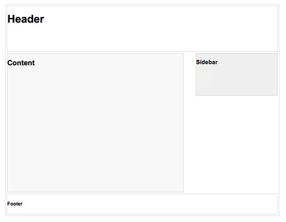
In this example, I have a basic page layout with a header, content container, sidebar, and a footer. The header has a fixed height 180px, content container is 600px wide and sidebar is 300px wide.
structure

Step 3. Media Queries

CSS3 media query is the trick for responsive design. It is like writing if conditions to tell the browser how to render the page for specified viewport width.
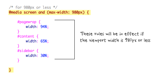
The following set of rules will be in effect if the viewport width is 980px or less. Basically, I set all the container width from pixel value to percentage value so the containers will become fluid.
image
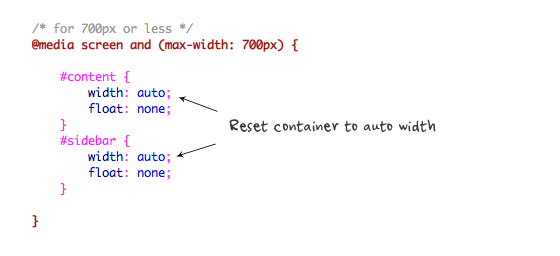
Then for viewport 700px or less, specify the #content and #sidebar to auto width and remove the float so they will display as full width.
image
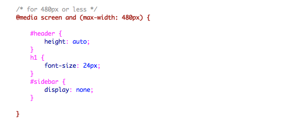
For 480px or less (mobile screen), reset the #header height to auto, change the h1 font size to 24px and hide the #sidebar.
image
You can write as many media query as you like. I've only shown 3 media queries in my demo. The purpose of the media queries is to apply different CSS rules to achieve different layouts for specified viewport width. The media queries can be in the same stylesheet or in a separate file.

Conclusion

This tutorial is intended to show you the basics of responsive design. If you want more in-depth tutorial, check out my previous tutorial: Responsive Design With Media Queries.

Ref Links:

http://designinstruct.com/web-design/what-is-responsive-web-design/

http://www.awwwards.com/websites/responsive-design/

http://smallbiztrends.com/2013/05/what-is-responsive-web-design.html

http://webdesignerwall.com/tutorials/responsive-design-in-3-steps

http://www.readerspark.com/threads/how-to-create-a-responsive-web-design.35/

http://blog.teamtreehouse.com/beginners-guide-to-responsive-web-design

React + Typescript_ Module federation _ Micro Front end -Standalone and integrated

Module Federation The Module Federation is actually part of Webpack config. This config enables us to expose or receive different parts of t...